Project Overview
Rebranding myself was harder than rebranding any client I had worked with.
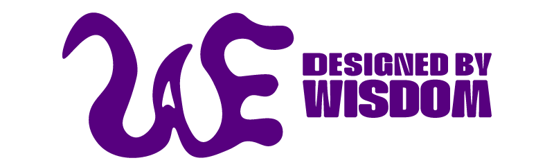
The identity centres on WAE, a monogram formed from my initials: Wisdom A. Edogiawerie.
My original WAE mark supported me throughout school, but over time it stopped feeling like an accurate reflection of who I had become. After graduating, I wanted a visual identity that felt more confident, expressive, and personal.
The result was Designed by Wisdom, a refreshed identity built around movement, character, and creative growth.
The Challenge
The original WAE logo had personal meaning, but its rigid letterforms no longer matched the direction of my work or the designer I was becoming.
The challenge was to redesign the mark without completely losing its history. I wanted the new identity to:
Preserve the original WAE structure
Feel more expressive and recognizable
Reflect growth after graduation
Communicate movement and visual storytelling
Work across my portfolio, LinkedIn, social media, and motion content
The project required more than creating a new logo. It required defining how I wanted people to experience my work and understand my identity as a designer.
Creative Direction
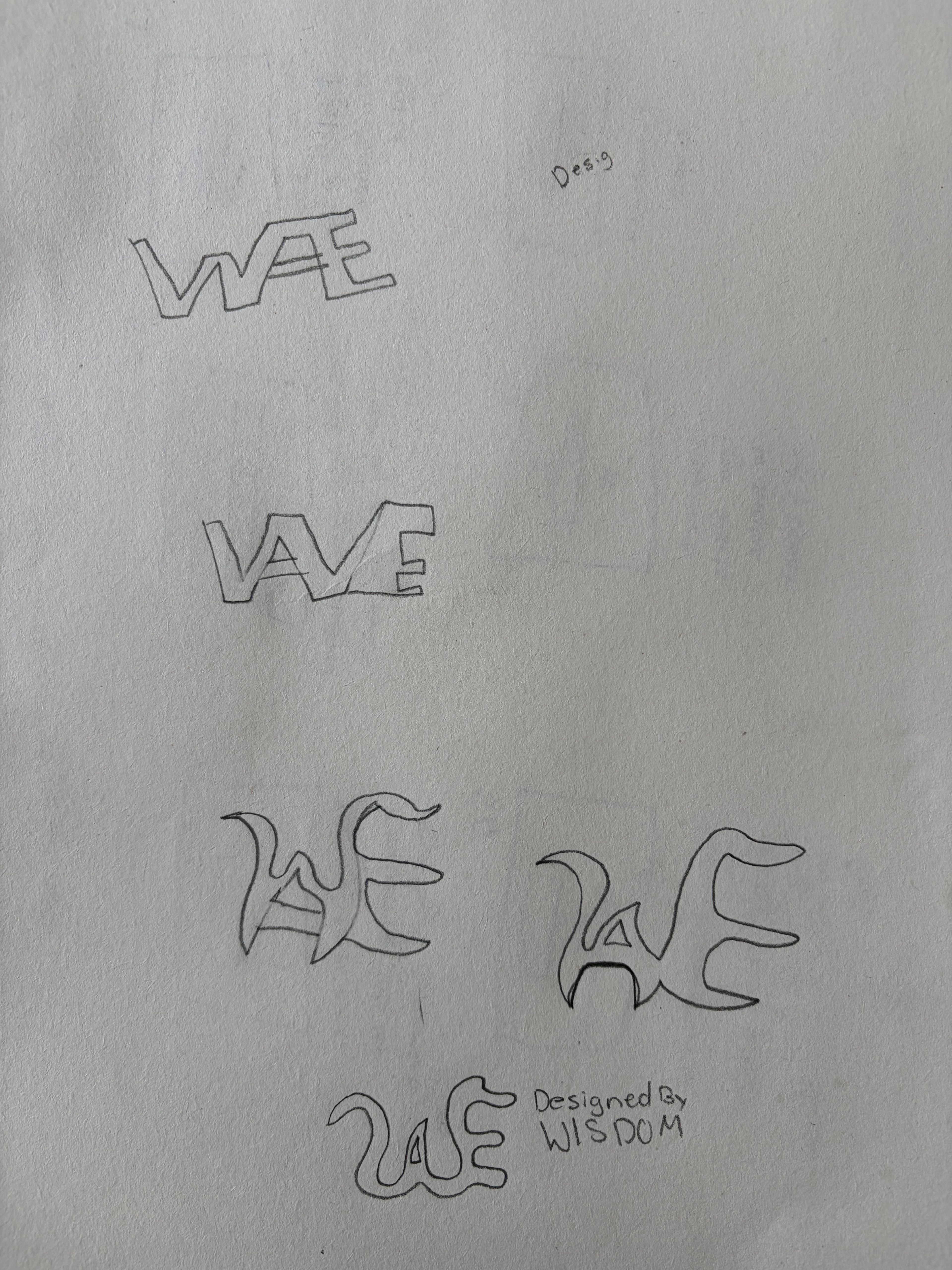
I explored several ways of connecting the letters W, A, and E.
My early sketches focused on overlapping and interlocking letterforms. Some concepts used sharper geometric shapes, while others introduced softer curves and more fluid movement.
As the exploration developed, I moved away from rigid construction and began drawing the letters with a more organic rhythm. This direction felt more natural and gave the mark greater personality.
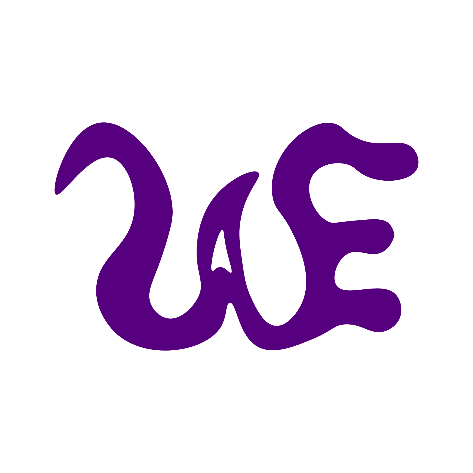
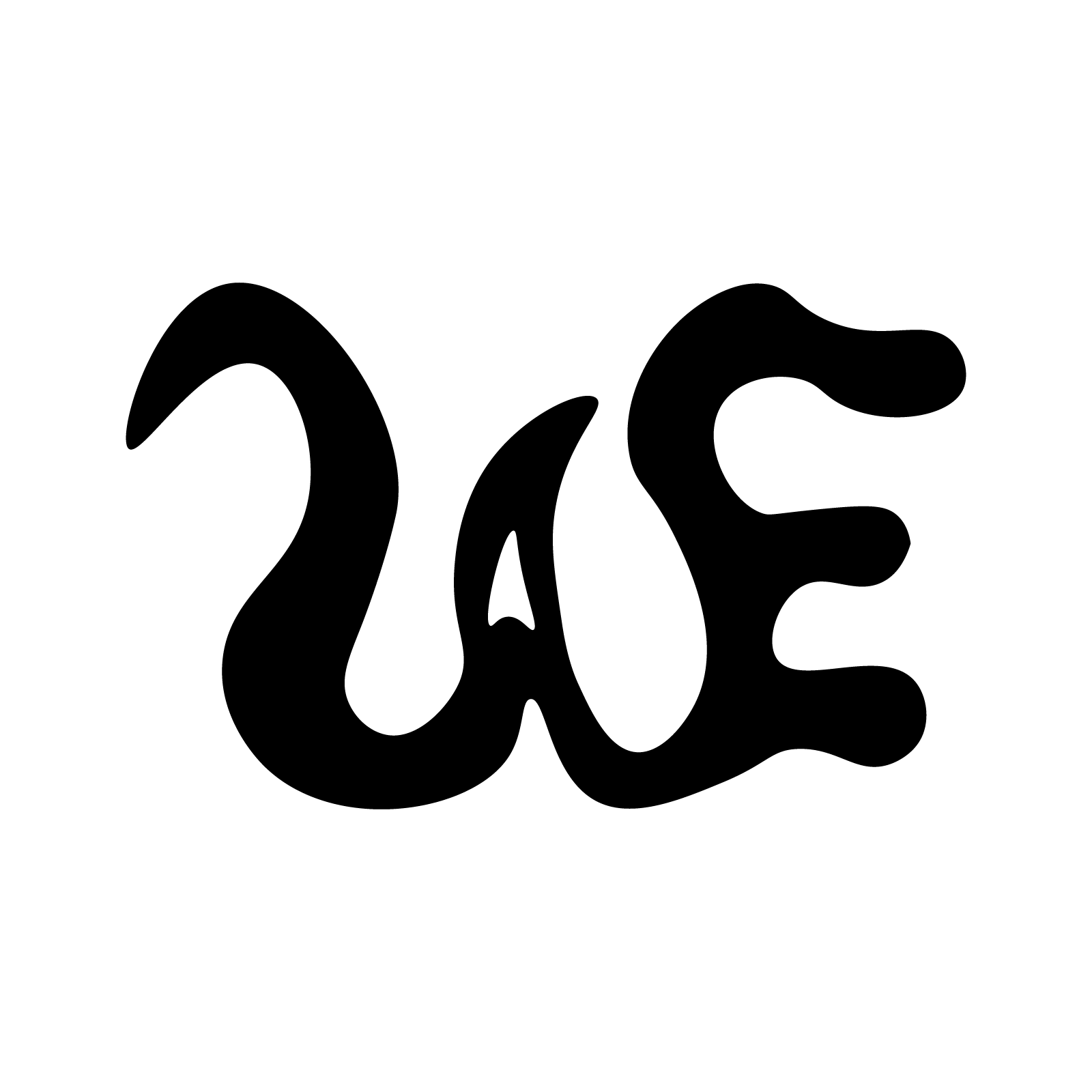
The final symbol combines the three initials into one continuous visual form. The curved shapes create movement, while the unusual letter construction makes the mark more distinctive.
The supporting wordmark, Designed by Wisdom, adds clarity and makes the identity easier to understand when the symbol appears for the first time.
Sketch Development
The sketching stage helped me test:
Different relationships between the W, A, and E
Angular versus curved letterforms
Overlapping and connected structures
The visibility of each letter
The balance between readability and personality
The strongest direction came from allowing the letters to flow into one another rather than forcing them into a traditional monogram.
This gave the identity the movement and character that the original mark lacked.
Logo System and Variations
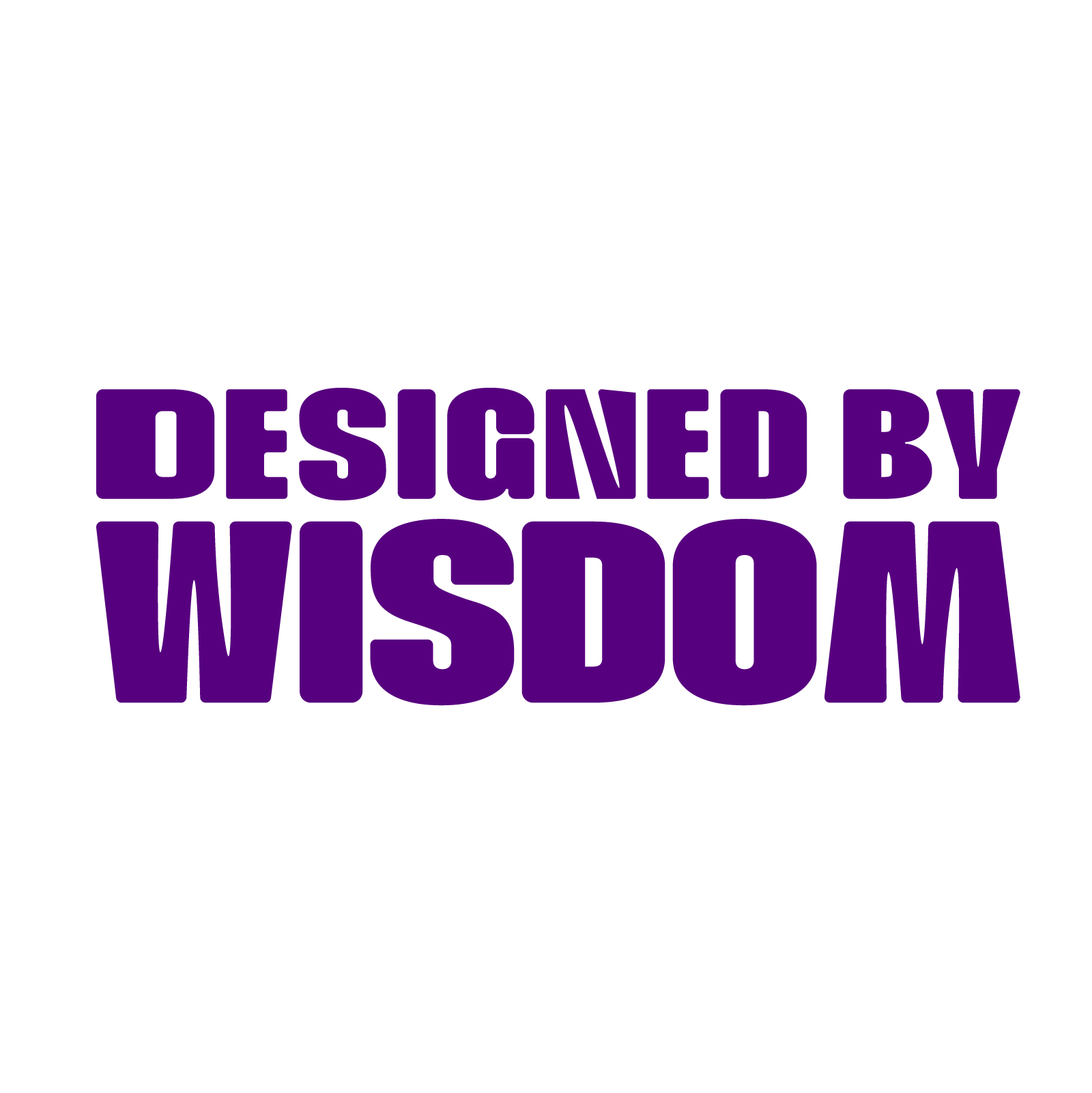
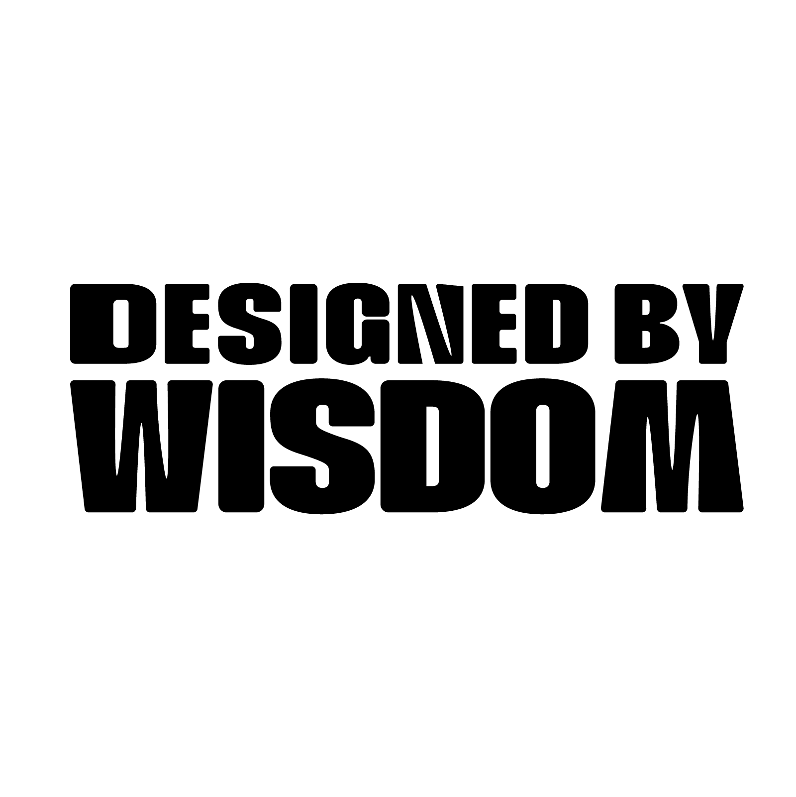
The final identity was designed as a flexible logo system for different formats, backgrounds, and applications.
The system includes:
A standalone WAE lettermark
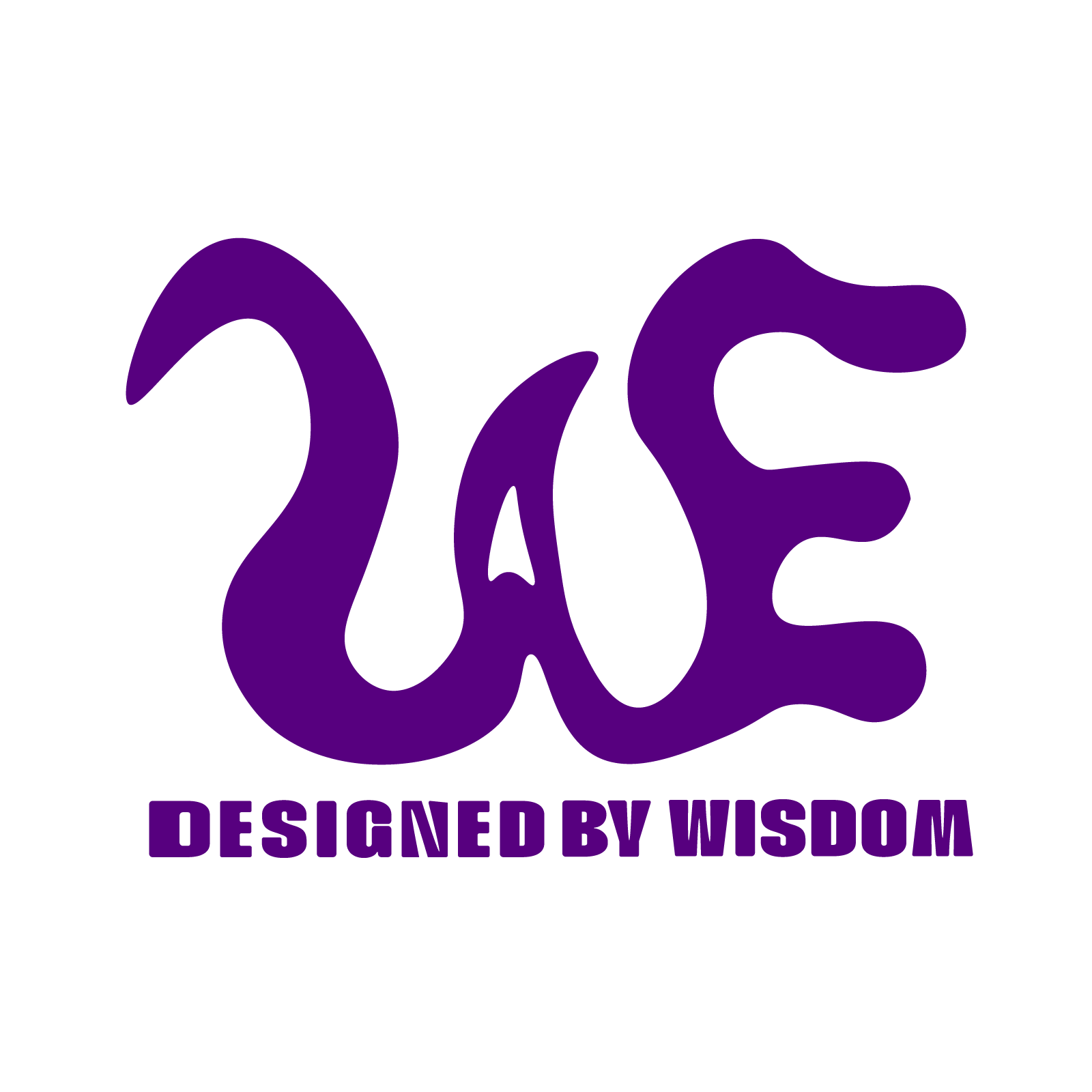
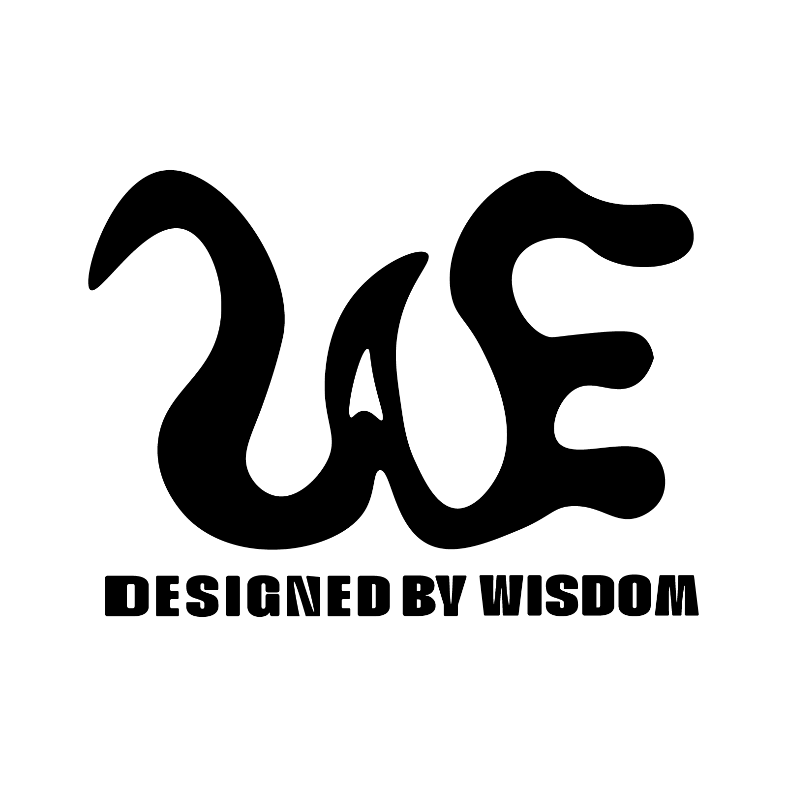
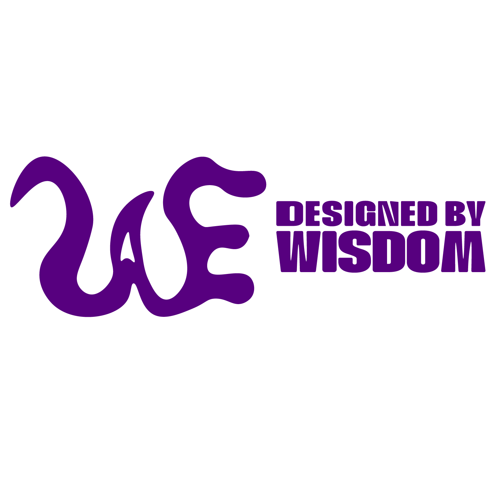
A horizontal logo lockup
A stacked logo lockup
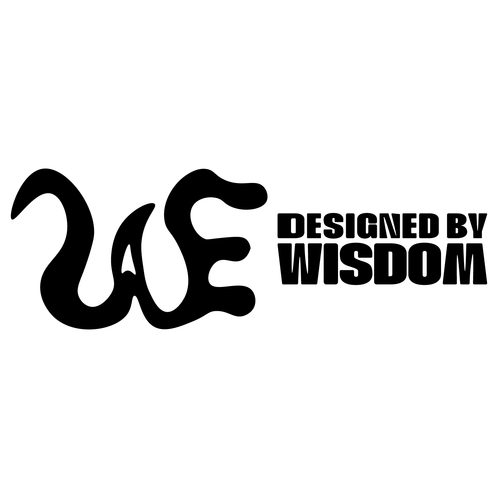
Purple and black versions
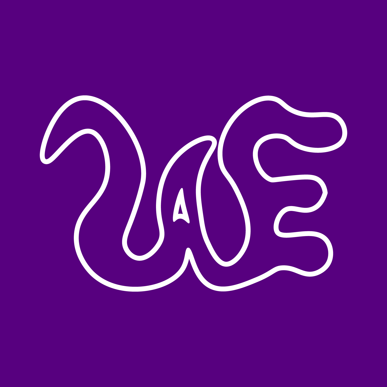
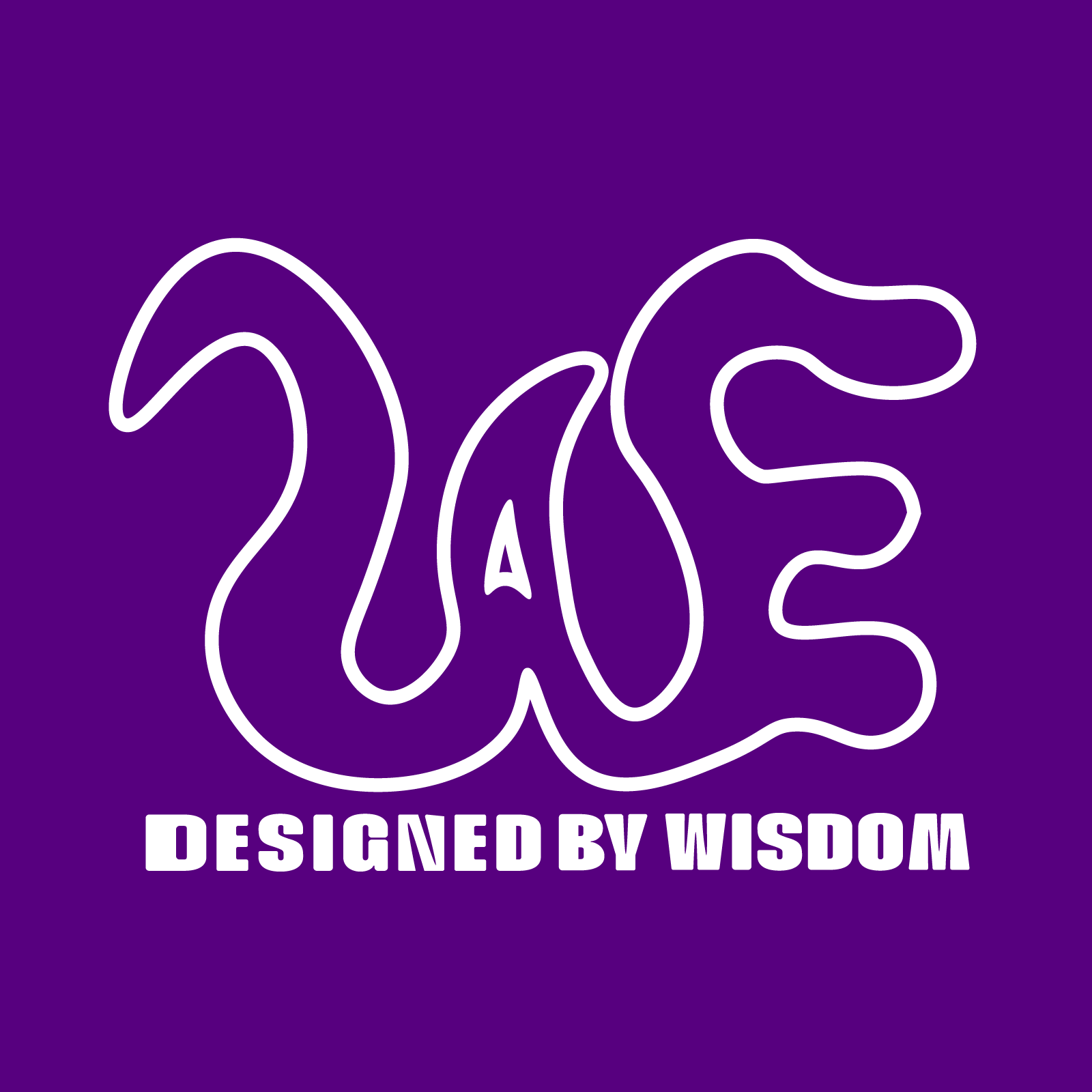
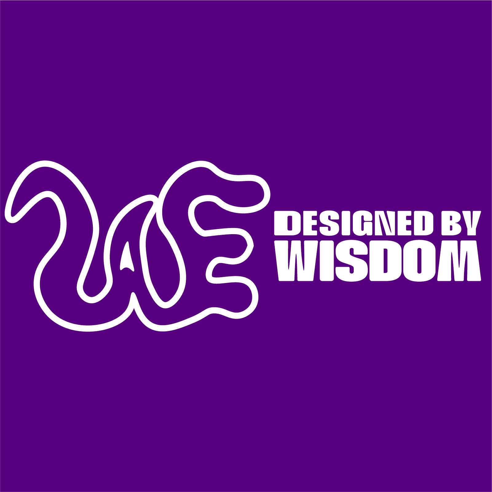
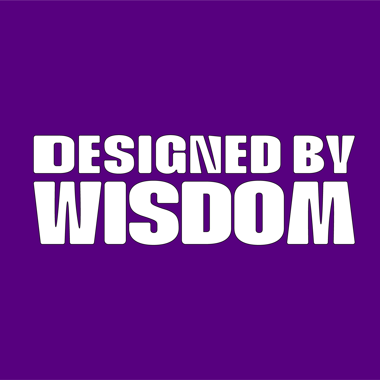
A white-outlined version
Wordmark-only variations
The WAE lettermark serves as the main brand symbol, while the Designed by Wisdom wordmark provides clarity in unfamiliar contexts.
Colour and Contrast
Purple is the primary brand colour, supported by black and white.
The purple and black versions work best on light backgrounds. The white outlined logo acts as a secondary version for coloured or dark backgrounds where the solid logos do not provide enough contrast.
Logo Use
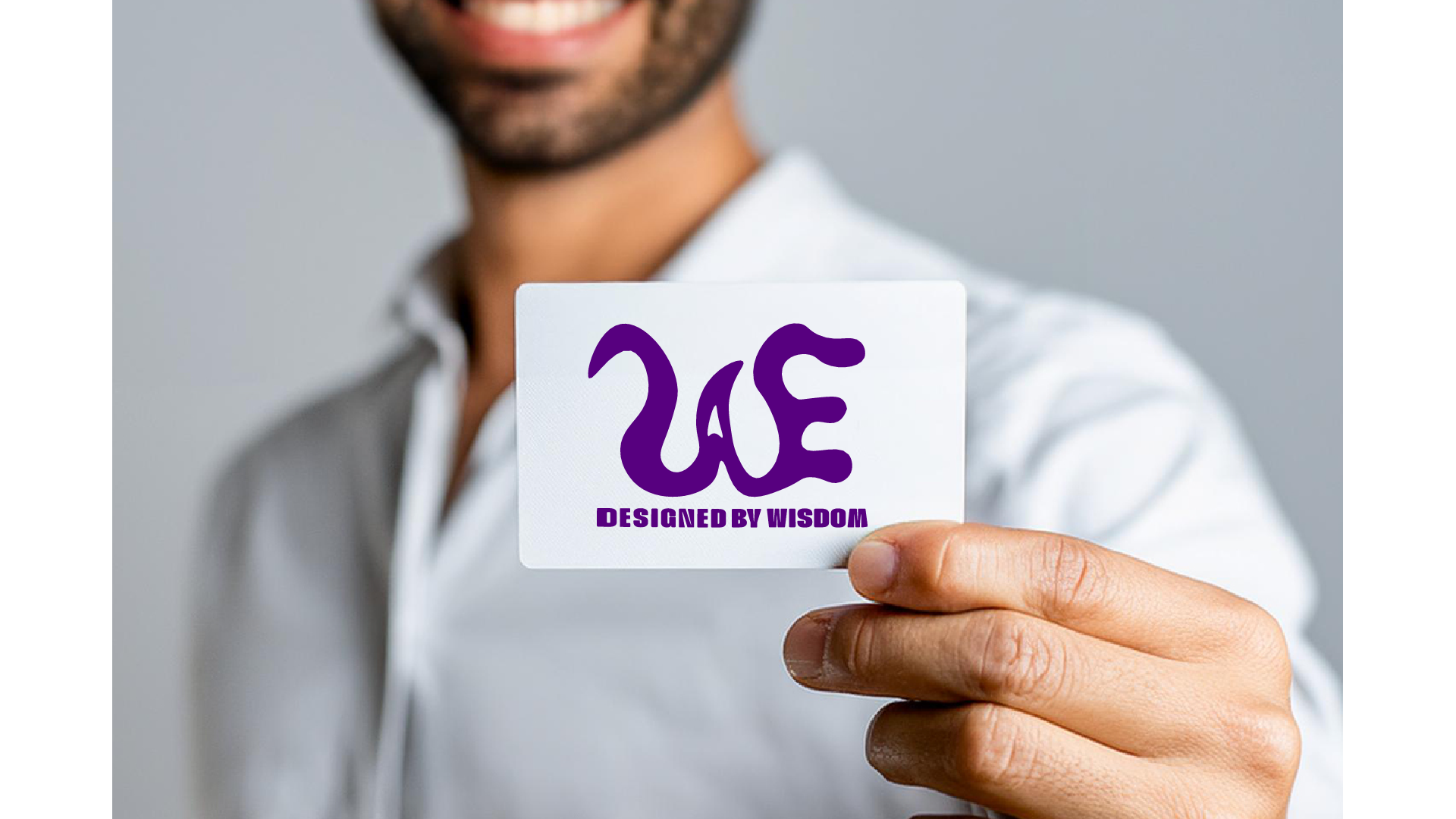
Primary logo: Horizontal lockup for banners, headers, websites, and LinkedIn.
Secondary logo: Stacked lockup for square layouts, posters, portfolio covers, and social media.
Brand mark: Standalone WAE symbol for avatars, watermarks, animation, and smaller applications.
Wordmark: Designed by Wisdom used on its own when readability or limited space is the priority.
Together, these variations allow the identity to remain consistent across digital, print, social, and motion applications.
Logo Animation
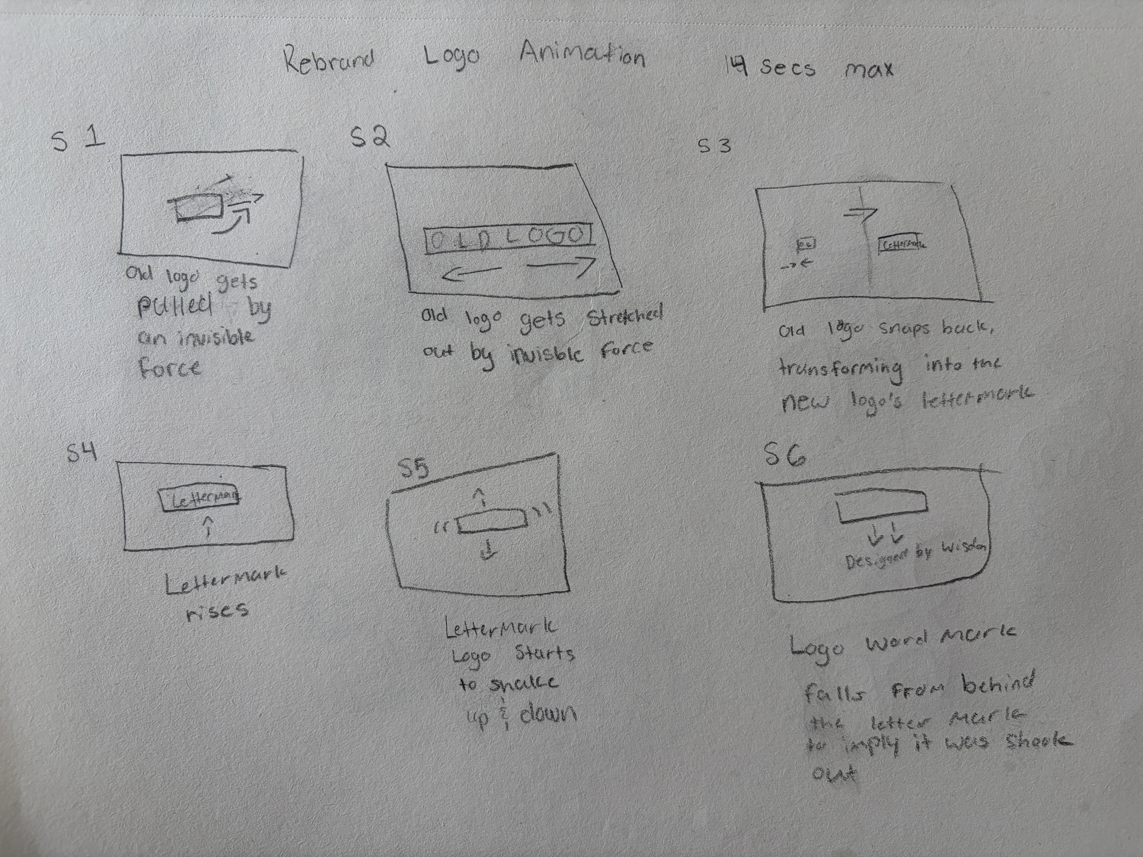
The rebrand concludes with a short logo animation that transforms the old WAE mark into the new identity.
I began by storyboarding the sequence to plan the timing, movement, and transition between each stage. The original logo stretches under an invisible force before snapping into the new WAE lettermark. The mark then settles into position, followed by the Designed by Wisdom wordmark.
The animation uses stretching, shaking, and controlled movement to represent growth and transformation. It brings the rebrand to life while reinforcing the fluid character of the new visual identity.
Tools: Adobe After Effects and Adobe Illustrator
Duration: Approximately 5 seconds
Duration: Approximately 5 seconds