Brand design by Wisdom Edogiawerie. Mockup template via Adobe Stock and Adobe Firefly.
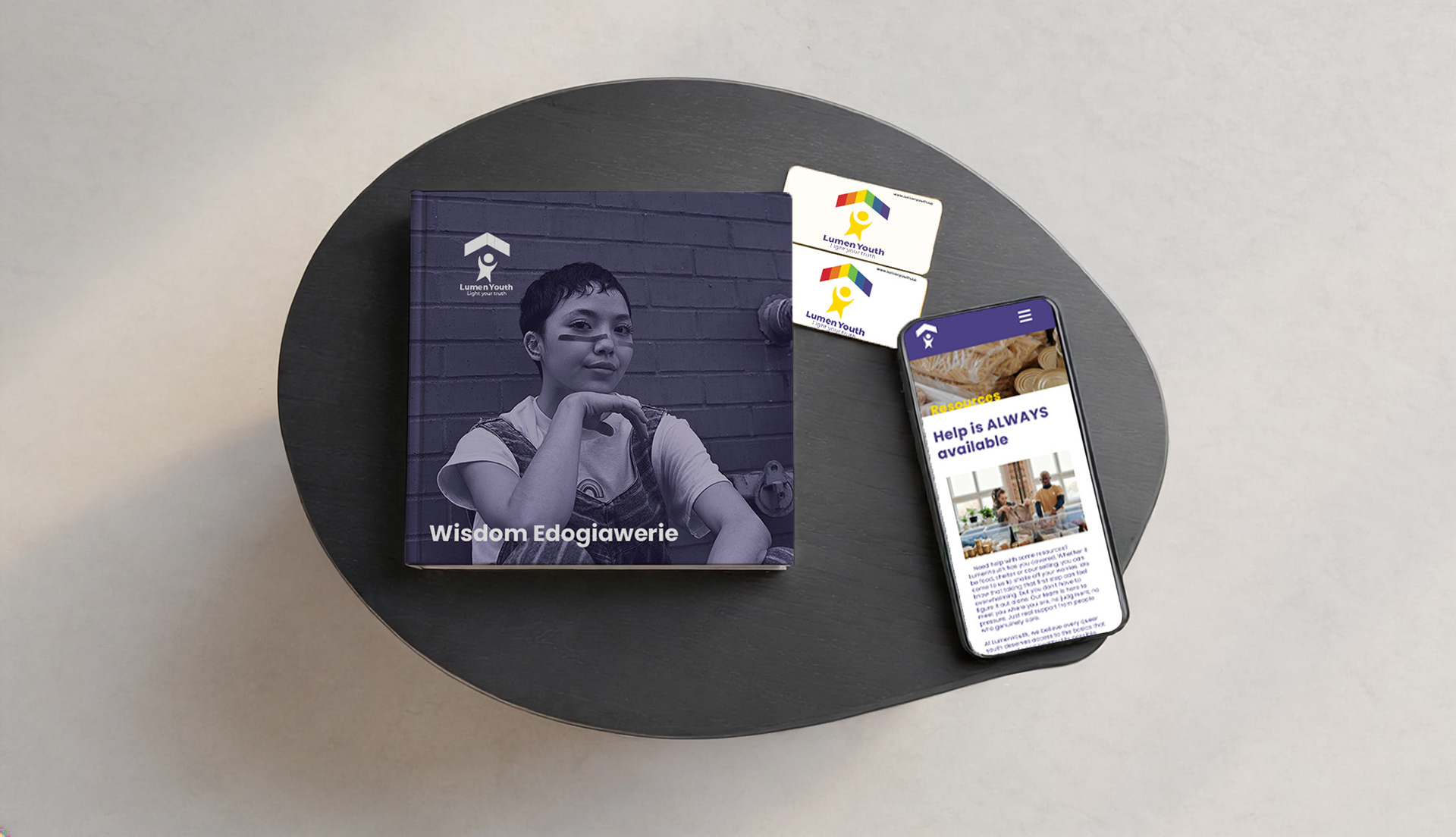
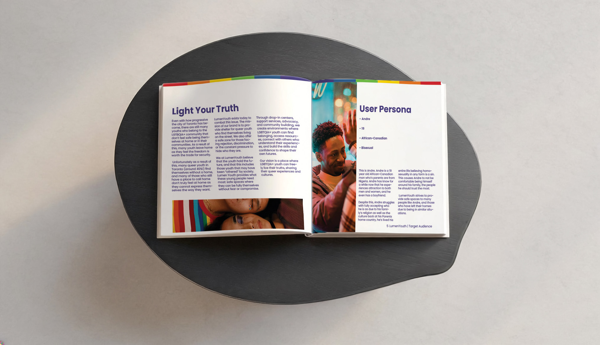
LumenYouth started with a question: what would it look like to design a brand that makes the most vulnerable youth in Toronto feel seen? To answer that, I conceptualized and built a complete brand identity for LumenYouth, a nonprofit concept addressing the housing insecurity faced by LGBTQIA+ youth in Toronto. With nearly 40% of queer youth in the city experiencing homelessness, I wanted to build something around a cause that is very real, even if the organization itself is not. The goal was to develop a brand identity from the ground up that reflects warmth, safety, and pride, creating a visual language that speaks directly to youth who have often been made to feel invisible. This project allowed me to explore how design can serve communities that are underrepresented, and how a brand can carry emotional weight while still feeling accessible and bold. LumenYouth is more than a shelter concept. It is an exercise in designing with empathy and intention.
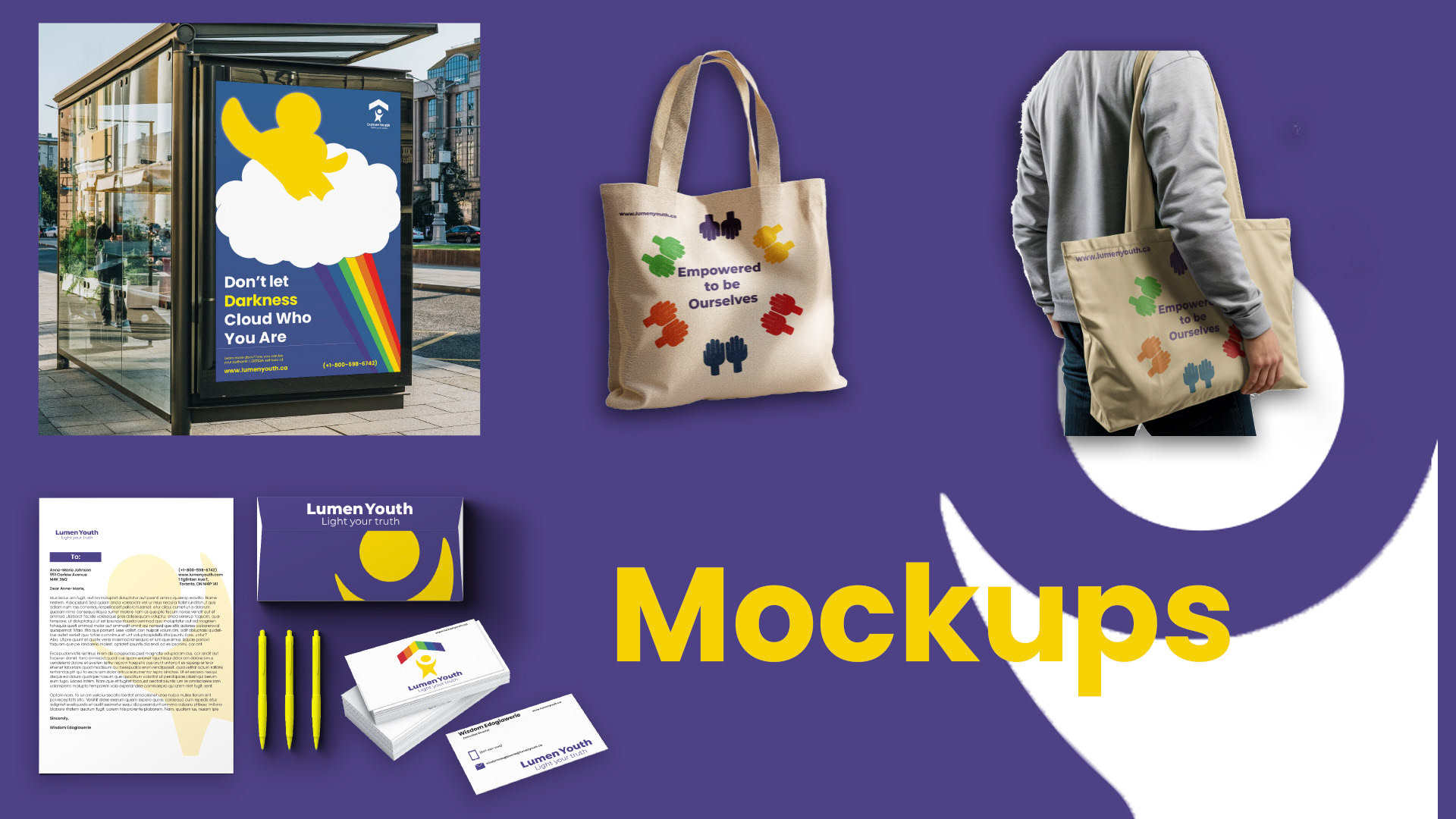
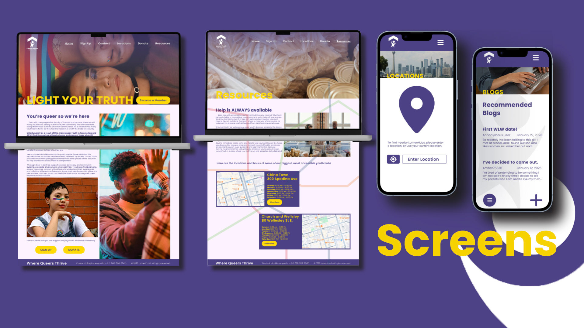
Brand design by Wisdom Edogiawerie. Mockup templates via Adobe Stock, Adobe Firefly, Figma, and Unblast.com
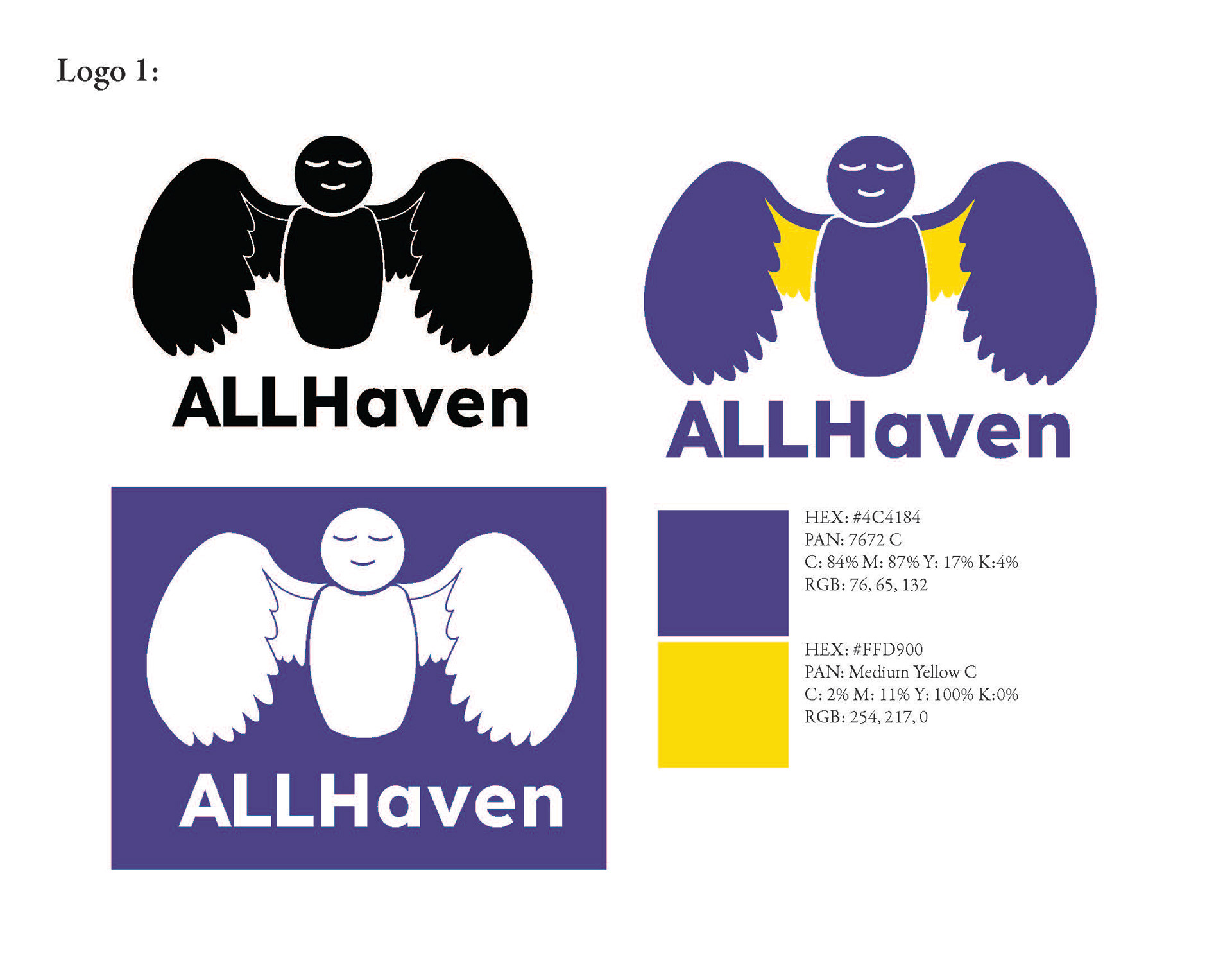
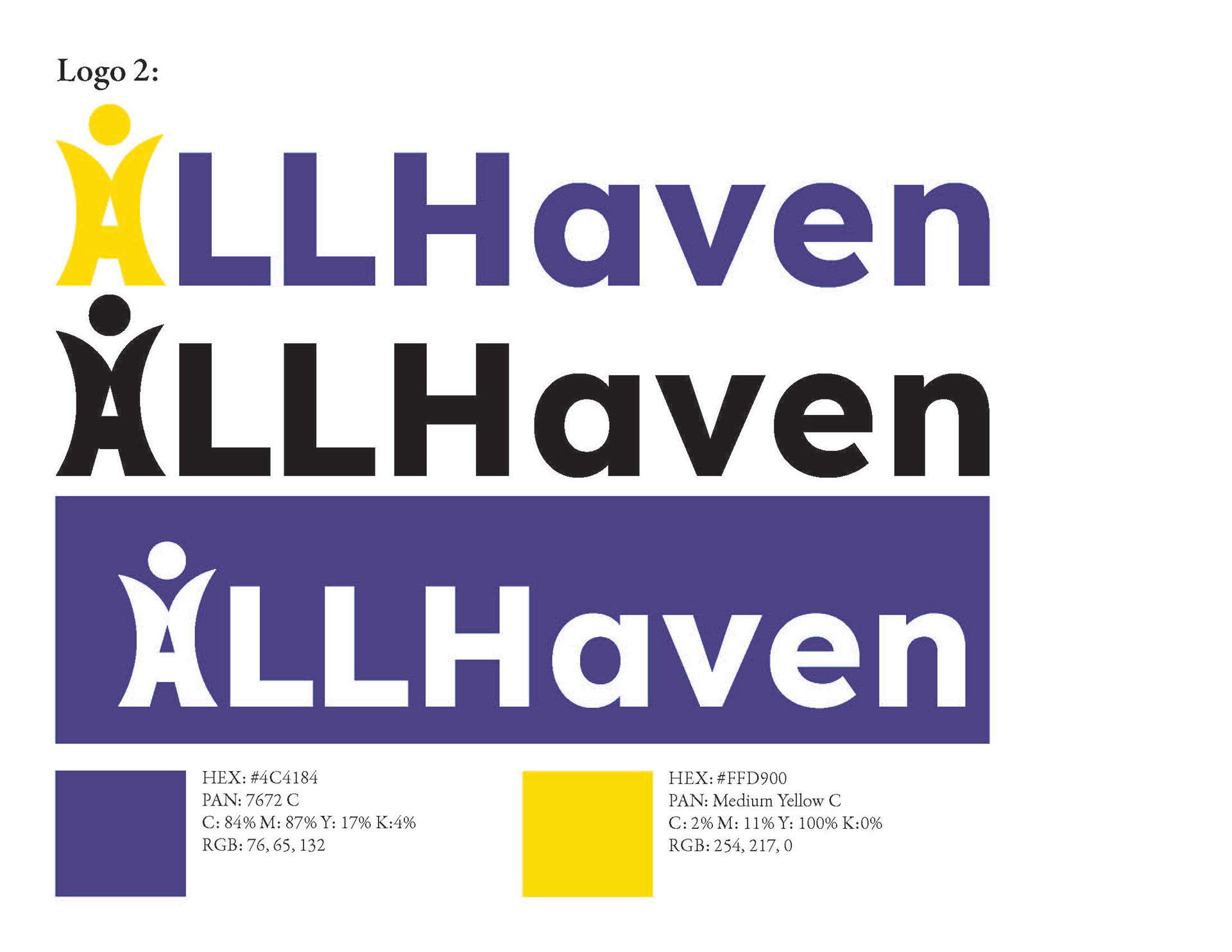
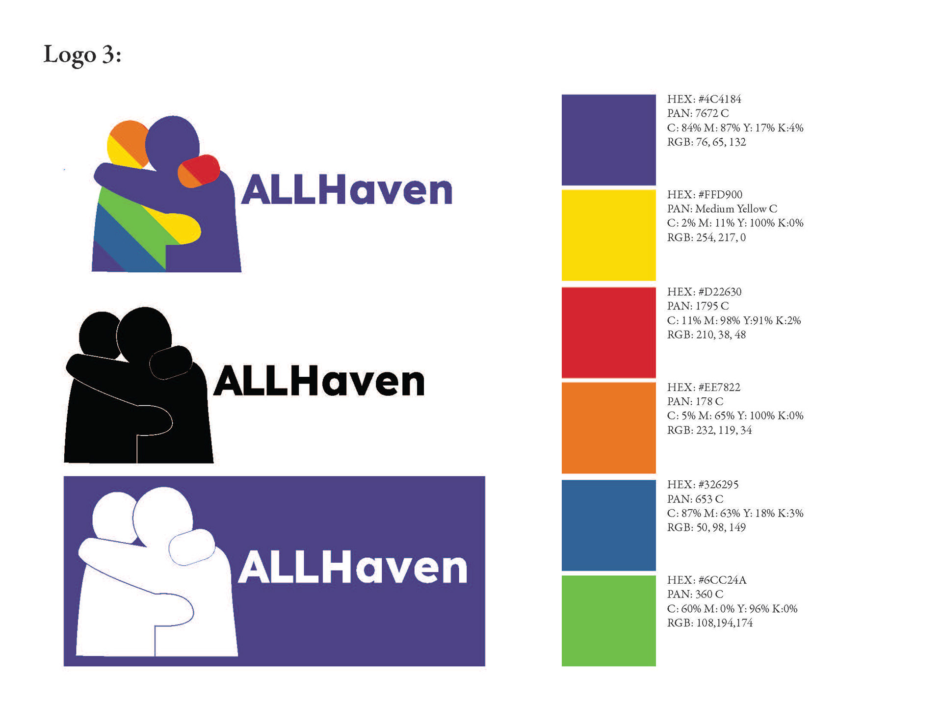
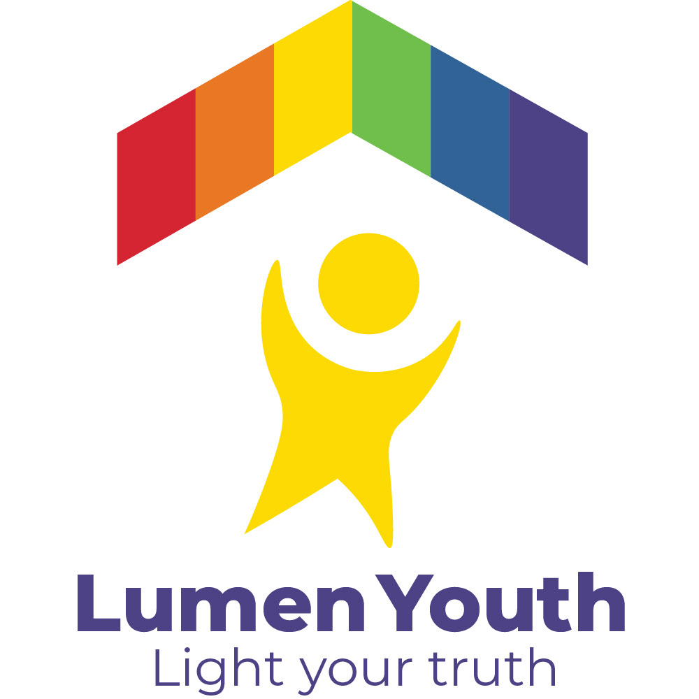
The logo went through several concept iterations before arriving at the final design. For Lumen Youth's logo, my goal was to capture a feeling of safety and inclusivity, while incorporating subtle LGBTQIA+ symbolism.
In logos #1 and #3, the iconography felt too unspecific and difficult to parse, particularly in logo #3, where one of the characters was multicoloured, which made the silhouette harder to read clearly. Logo #2 was the strongest concept at this stage, though the figure I'd built from the typeface's "A" didn't fully read as either a letterform or a character in an energetic pose.
Another issue at this point was that the concepts were still designed under a previous name, "All Haven." While this name worked well to promote inclusivity, it didn't clearly speak to the specific demographic I was designing for. From there, I workshopped the name "Lumen Youth," using "Lumen" to represent lighting up the dark path many queer youth may face due to feeling unsafe at home or in public. I also developed the tagline "Light Your Truth" as part of the logo system, intended to remind youth of all kinds to embrace who they truly are.
To align with the new brand name, I took the "A" character originally designed for All Haven and developed it into its own standalone figure, topped with a multicoloured roof shape to represent both LGBTQIA+ symbolism and the idea of shelter for those who need it. I also exaggerated the character's pose further, as I find asymmetry to be a compelling design choice.